Introduction
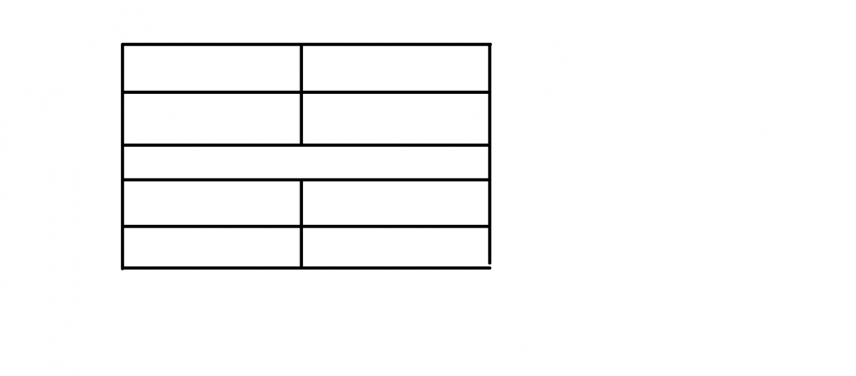
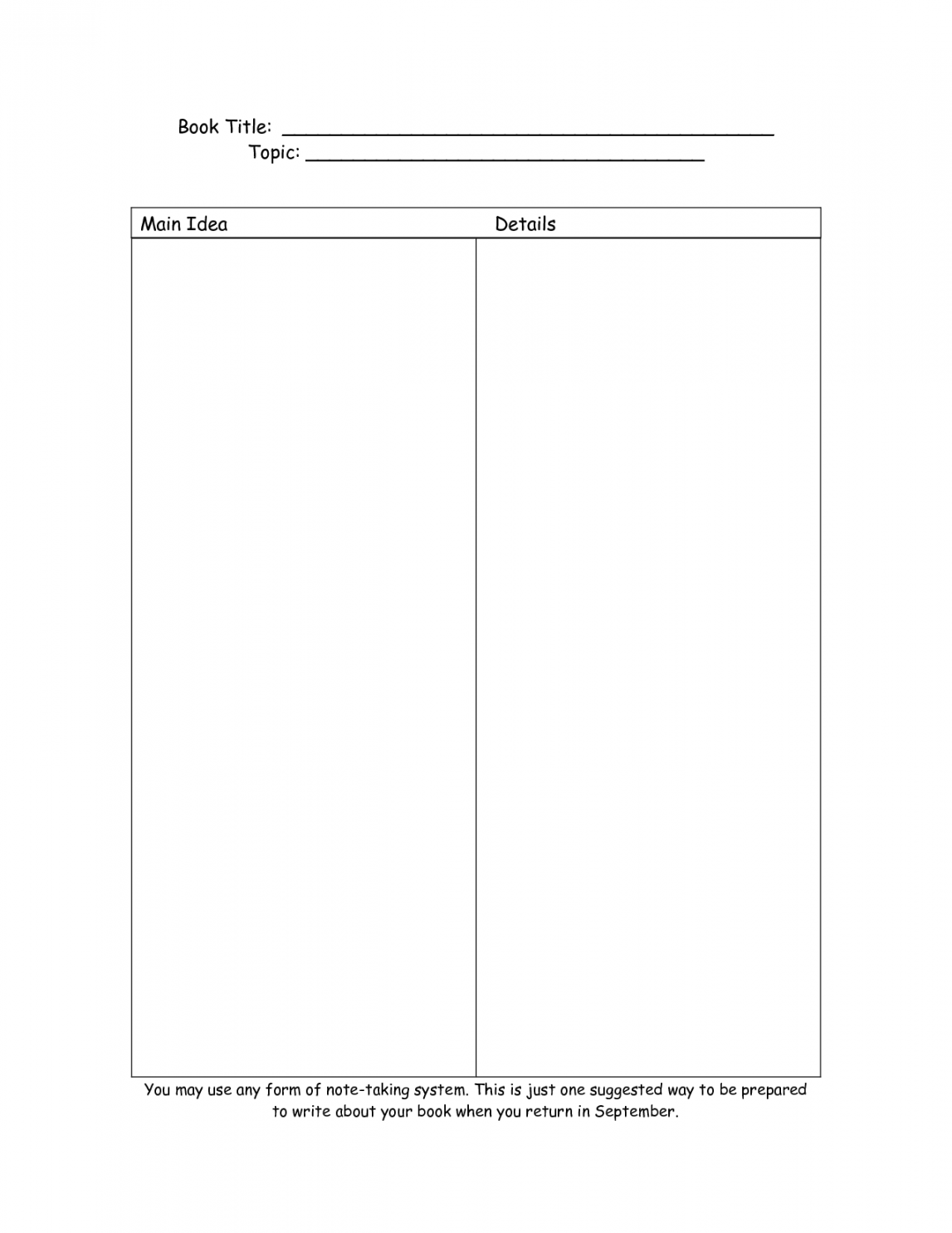
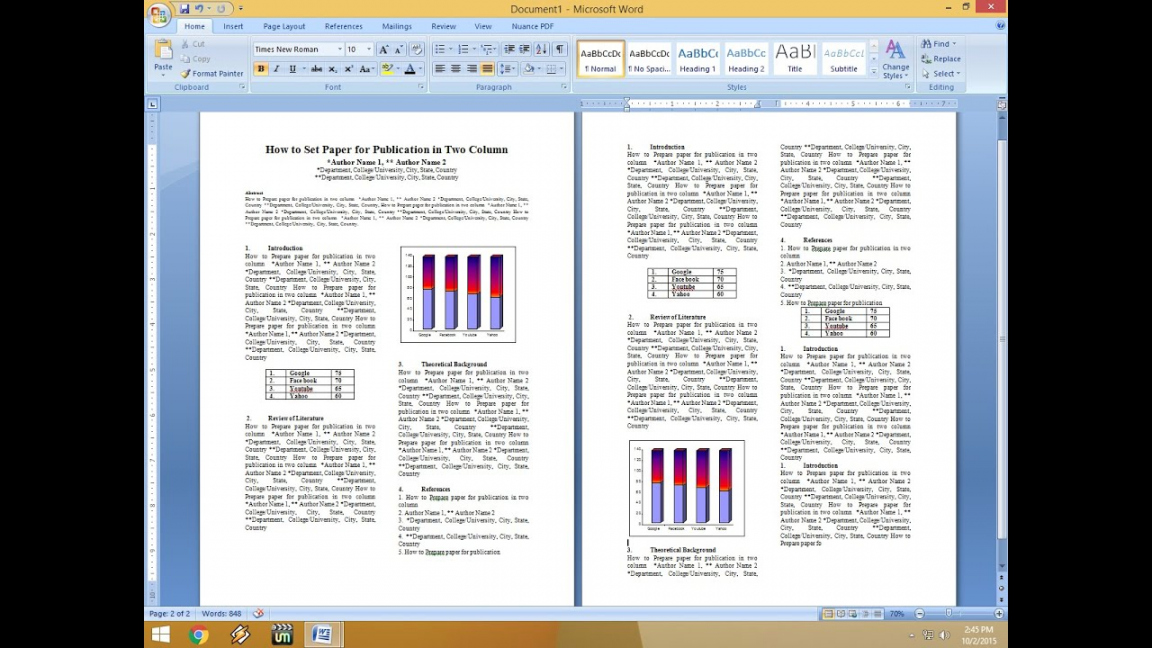
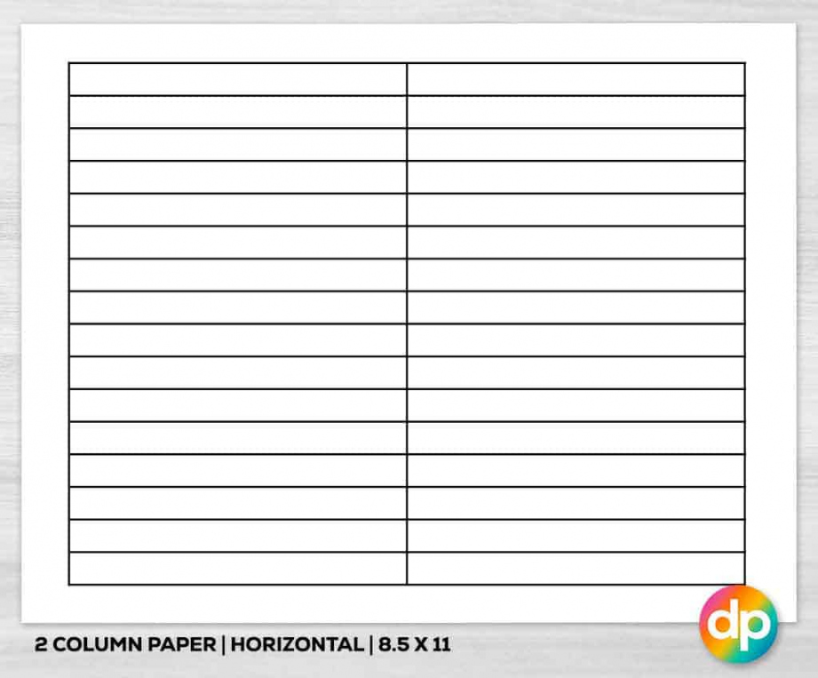
Two Column is a popular layout used in web design, providing a visually appealing and organized way to present content. This layout divides the screen or page into two equal columns, allowing for efficient use of space and easy readability. In this article, we will explore the benefits and usage of the Two Column layout, highlighting its versatility and effectiveness in various contexts.
Benefits of Two Column Layout
Enhanced Readability
One of the key advantages of the Two Column layout is its ability to enhance the readability of content. By splitting the screen or page into two columns, the text becomes more compact and easier to digest for readers. This layout eliminates the need for long lines of text, reducing eye strain and improving overall user experience.
Improved Visual Hierarchy

Two Column layout also helps establish a clear visual hierarchy within a web page. By placing important content in one column and supporting information or secondary content in the other, designers can guide users’ attention to the most relevant information. This hierarchy aids in conveying the intended message effectively and efficiently.
Optimized Space Usage
Efficient utilization of space is another significant advantage of the Two Column layout. This layout allows designers to make the most out of screen or page real estate, ensuring that content is well-distributed and organized. By utilizing two columns instead of one, designers can accommodate more information without overwhelming the user.
Flexible Content Arrangement

The Two Column layout offers flexibility in arranging different types of content. Whether it’s text, images, videos, or interactive elements, this layout can accommodate diverse content formats seamlessly. Designers have the freedom to experiment with content placement, creating visually appealing compositions that engage and captivate users.
Responsive Design Compatibility
In today’s mobile-centric world, responsive design is crucial to ensure optimal user experience across various devices. The Two Column layout is highly compatible with responsive design principles. It adapts well to different screen sizes and orientations, allowing content to flow smoothly and adapt to the available space dynamically.
Usage of Two Column Layout
Blog Design

The Two Column layout is widely used in blog design. It offers an effective way to present blog posts, with the main content displayed in one column and supplementary information such as author details, categories, and recent posts in the other. This layout makes it easy for readers to focus on the main text while providing additional context and navigation options.
E-commerce Websites
E-commerce websites often utilize the Two Column layout to showcase products and their details. The main column features product images, descriptions, and pricing, while the secondary column can display related products, customer reviews, or additional information. This layout streamlines the product browsing experience, helping users make informed purchase decisions.
Magazine Style Websites

Magazine-style websites frequently adopt the Two Column layout to organize and present various articles and news stories. With the main content in one column and supplementary details like author information, publication date, and related articles in the other, this layout creates a visually appealing and informative reading experience.
Portfolio Websites
Two Column layout is also popular in portfolio websites, allowing designers to showcase their work effectively. The main column presents the portfolio items, such as images or project descriptions, while the secondary column can include additional details like client testimonials, contact information, or social media links. This layout enables designers to highlight their skills and expertise while providing further context to potential clients.
Knowledge Base or Help Center
For knowledge bases or help centers, the Two Column layout proves useful in organizing a vast amount of information. The main column can display the content categories or search results, while the secondary column can show related articles, frequently asked questions, or relevant resources. This layout simplifies navigation and improves the overall user experience when seeking guidance or answers to specific queries.
Conclusion
The Two Column layout offers numerous benefits and is widely used in various web design contexts. Its ability to enhance readability, establish visual hierarchy, optimize space usage, accommodate diverse content formats, and adapt to responsive design principles makes it a popular choice among designers. Whether it’s for blogs, e-commerce websites, magazines, portfolios, or knowledge bases, the Two Column layout provides an effective and visually appealing way to present content and engage users.
Join the Free Printable Frenzy…
Copyright Notice:
All images used here are from the internet, with copyrights owned by their original owners. If you want any image removed due to copyright reasons, please get in touch with us.